
(05) Yayoi Kusama Museum
Custom Typeface
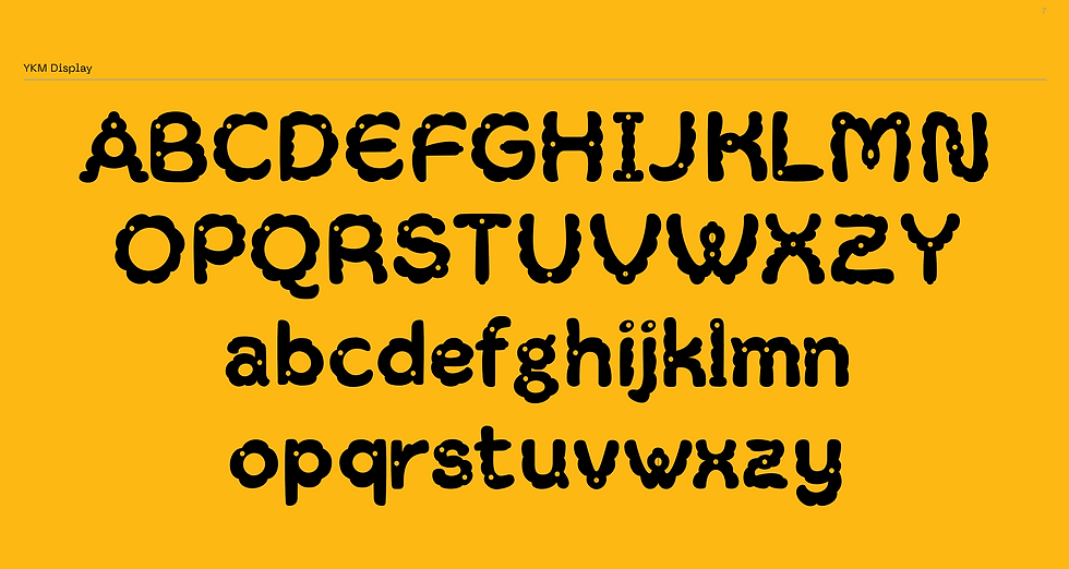
I designed a display typeface and brand identity for the museum. Inspired by her iconic paintings and sculptures, the typeface features rounded, playful forms that evoke a sense of humor and warmth.
These include asymmetrical curves, rounded bubbles, and polka dots, all hallmarks of her
distinctive style. By weaving these elements into the typeface design, I aimed to create a cohesive
and harmonious visual language that pays tribute to Kusama’s art while also standing as a unique
and compelling creation.
Secondary Typeface
& Brand color
For the secondary typeface, I chose PP Mori, a sans serif inspired by contemporary Japanese design. it embodies modern minimalism and a cultural connection that resonates with modern aeththethic of japan, its clean, contemporary lines enhance readability while honoring the museum’s innovative spirit.
For the brand color palette, inspiration was drawn from the sculptures and paintings of Yayoi Kusama, creating a connection between her art and the brand identity. The chosen colors form a harmonious visual system.
Brand design
Typeface design
Motion design
(05) Yayoi Kusama Museum
The Yayoi Kusama Museum, located in Tokyo, is dedicated to the life and works of the celebrated contemporary artist Yayoi Kusama.
The museum offers visitors an intimate glimpse into her prolific career through rotating exhibitions of her paintings, sculptures, and installations, reflecting her boundless creativity and enduring impact on the art world.

Custom Typeface
I designed a display typeface and brand identity for the museum. Inspired by her iconic paintings and sculptures, the typeface features rounded, playful forms that evoke a sense of humor and warmth.
These include asymmetrical curves, rounded bubbles, and polka dots, all hallmarks of her
distinctive style. By weaving these elements into the typeface design, I aimed to create a cohesive
and harmonious visual language that pays tribute to Kusama’s art while also standing as a unique
and compelling creation.

Secondary typface
& Brand color
For the secondary typeface, I chose PP Mori, a sans serif inspired by contemporary Japanese design. it embodies modern minimalism and a cultural connection that resonates with modern aeththethic of japan, its clean, contemporary lines enhance readability while honoring the museum’s innovative spirit.
For the brand color palette, inspiration was drawn from the sculptures and paintings of Yayoi Kusama, creating a connection between her art and the brand identity. The chosen colors form a harmonious visual system


The Yayoi Kusama Museum, located in Tokyo, is dedicated to the life and works of the celebrated contemporary artist Yayoi Kusama.
The museum offers visitors an intimate glimpse into her prolific career through rotating exhibitions of her paintings, sculptures, and installations, reflecting her boundless creativity and enduring impact on the art world.
I designed a display typeface and brand identity for the museum. Inspired by her iconic paintings and sculptures, the typeface features rounded, playful forms that evoke a sense of humor and warmth. These include asymmetrical curves, rounded bubbles, and polka dots, all hallmarks of herdistinctive style. By weaving these elements into the typeface design, I aimed to create a cohesive and harmonious visual language that pays tribute to Kusama’s art while also standing as a uniqueand compelling creation.
I chose PP Mori as secondary typeface, a sans serif inspired by contemporary Japanese design. it embodies modern minimalism and a cultural connection that resonates with modern aeththethic of japan, its clean, contemporary lines enhance readability while honoring the museum’s innovative spirit. For the brand color palette, inspiration was drawn from the sculptures and paintings of Yayoi Kusama, creating a connection between her art and the brand identity. The chosen colors form a harmonious visual system.